library(terra)
library(rnaturalearth)
library(sf)
library(RColorBrewer)
library(ggplot2)
library(dplyr)
library(tidyterra)


# precip data ----
dat_nc <- rast(here::here("data",
                          "2025-04-15 precip",
                          "prcp-1991_2020-monthly-normals-v1.0.nc"))

dat_monthly <- dat_nc[[grep("mlyprcp_norm", names(dat_nc))]]
names(dat_monthly) <- month.abb

# convert to inches
monthly_in <- dat_monthly / 25.4

# crop to MS ----
# ms from rnaturalearth
ms_rne <- ne_states(country = "United States of America", returnclass = "sf") |>
    dplyr::filter(name == "Mississippi")
ms_rne <- sf::st_transform(ms_rne, crs(dat_monthly))

monthly_ms_in <- crop(monthly_in, ms_rne)
monthly_ms_in <- mask(monthly_ms_in, ms_rne)


# msep outline ----
msep <- read_sf(here::here("data",
                           "2025-04-15 precip",
                           "MSEP_outline.shp"))
msep <- st_transform(msep, crs(monthly_ms_in))Within 2 days of my first post here, where I struggled with maps and avoided using ggplot2 because I thought I had to turn my raster data into data frames first (thanks, chatGPT), I saw a post on LinkedIn about the tidyterra package. The link to the specific post doesn’t seem to work when I’m not logged in, but credit to Joachim Stork for talking about this package, which integrates terra with ggplot2.
I made a new faceted map, with labels everywhere I wanted them, within 20 minutes. I still want to figure out how to do a coarse binning of values, but I got a generally equivalent plot to the other packages, with all the labeling I wanted. I will note I’ve worked with ggplot2 for so long that some of the theming that was simple for me would not have been simple if I was coming to this from scratch - so it’s not necessarily that ggplot2 is better than the others; it’s just that I know it so it’s better for me.
Load the packages; read and trim the data the same way as before.
I made the faceted plot with tidyterra::geom_spatraster() and facet_wrap(~lyr). It was super easy; and then I used scale_fill_distiller() to get my favorite palette from RColorBrewer.
p <- ggplot() +
    geom_spatraster(data = monthly_ms_in) +
    facet_wrap(~lyr) +
    scale_fill_distiller(palette = "GnBu", direction = 1,
                         na.value = NA) +
    theme_minimal() +
    theme(axis.text = element_blank(),
          axis.ticks = element_blank(),
          strip.background = element_rect(fill = NA,
                                          color = NA),
          strip.text = element_text(face = "bold")) +
    labs(title = "Monthly Precipitation Normals",
         subtitle = "1991-2020 average",
         fill = "Inches")

p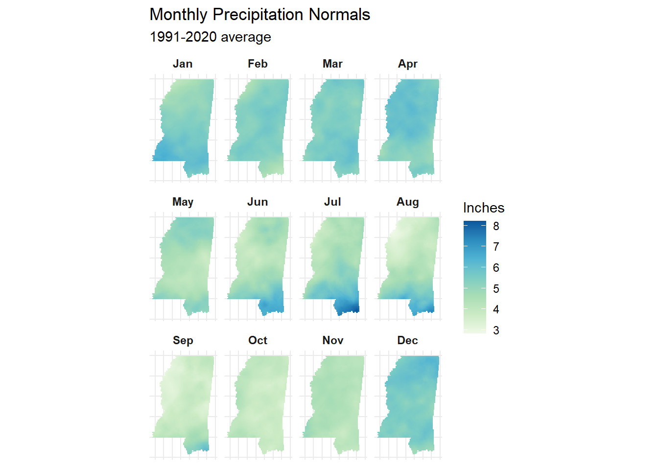
I’ve been removing axis text and tick marks a lot lately using theme(), but if you’re not familiar with all the options, check out the ggThemeAssist package. It provides a point-and-click interface to spruce up your plots once you have a general one made, and returns the code to you.
Once I had the general plot worked out, I added the MSEP’s boundary. This is where things got a little tricky for me, because I wanted the line to show up as a legend - so I used aes() inside geom_sf() and then forced the color to be how I wanted it with scale_color_manual(). Then I had to use labs() to make sure there wasn’t a title for that piece of the legend.
I wasn’t sure if using \n as a line break would actually work this way, but it did!
I had read in the layer with the sf package, so I used geom_sf() from ggplot2 at first.
p +
    geom_sf(data = msep,
                    fill = NA,
                    linewidth = 0.7,
                    aes(col = "MSEP \nboundary"),
                    show.legend = "line") +
    scale_color_manual(values = c("MSEP \nboundary" = "gray20")) +
    labs(col = NULL)
As I was putting this post together, I noticed that not only does tidyterra provide geom_spatraster(), but also geom_spatvector() - so I use that below. It comes out the same - which probably means I can use terra for all the data import? But I’ll save that exploration for another time.
p +
    geom_spatvector(data = msep,
                    fill = NA,
                    linewidth = 0.7,
                    aes(col = "MSEP \nboundary"),
                    show.legend = "line") +
    scale_color_manual(values = c("MSEP \nboundary" = "gray20")) +
    labs(col = NULL)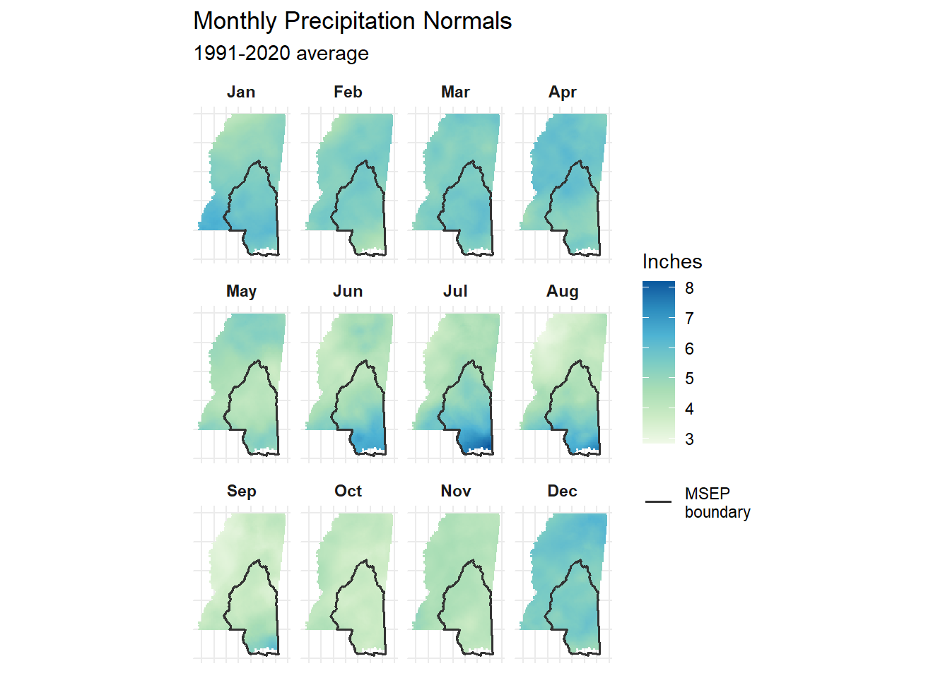
That’s all for today - happy mapping!